Sephora
Checkout Redesign
LOWER FUNNEL・FASHIONTECH・RESPONSIVE DESIGN・B2C
PROJECT OVERVIEW
Sephora is an industrial leading beauty chain in the U.S. Although it has a solid amount of customer base, the company's mobile app checkout system has always been an issue because of its poor design and confusing architecture.
I led the effort to research user pain points, understand best practices, conduct 50 benchmark studies of our competitors’ checkout flow, and work closely with product management and the other designer to ideate and iterate on solutions.
-
Sr. UX Designer
-
4 months
-
2 Designers/ 2 PMs

USER’S PAINT POINTS
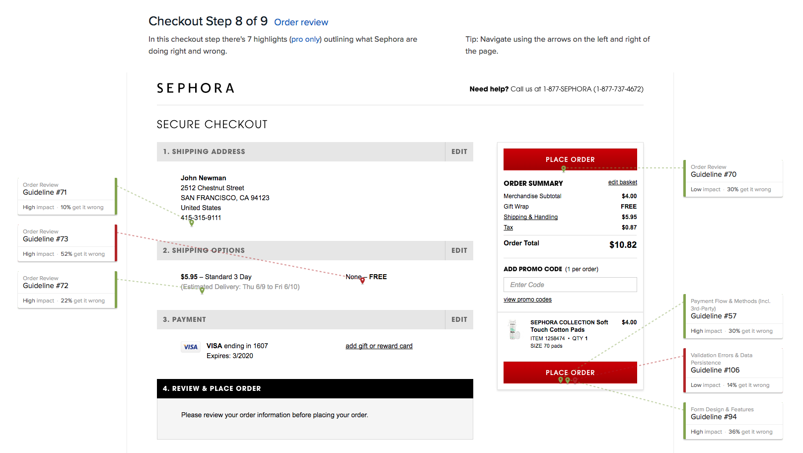
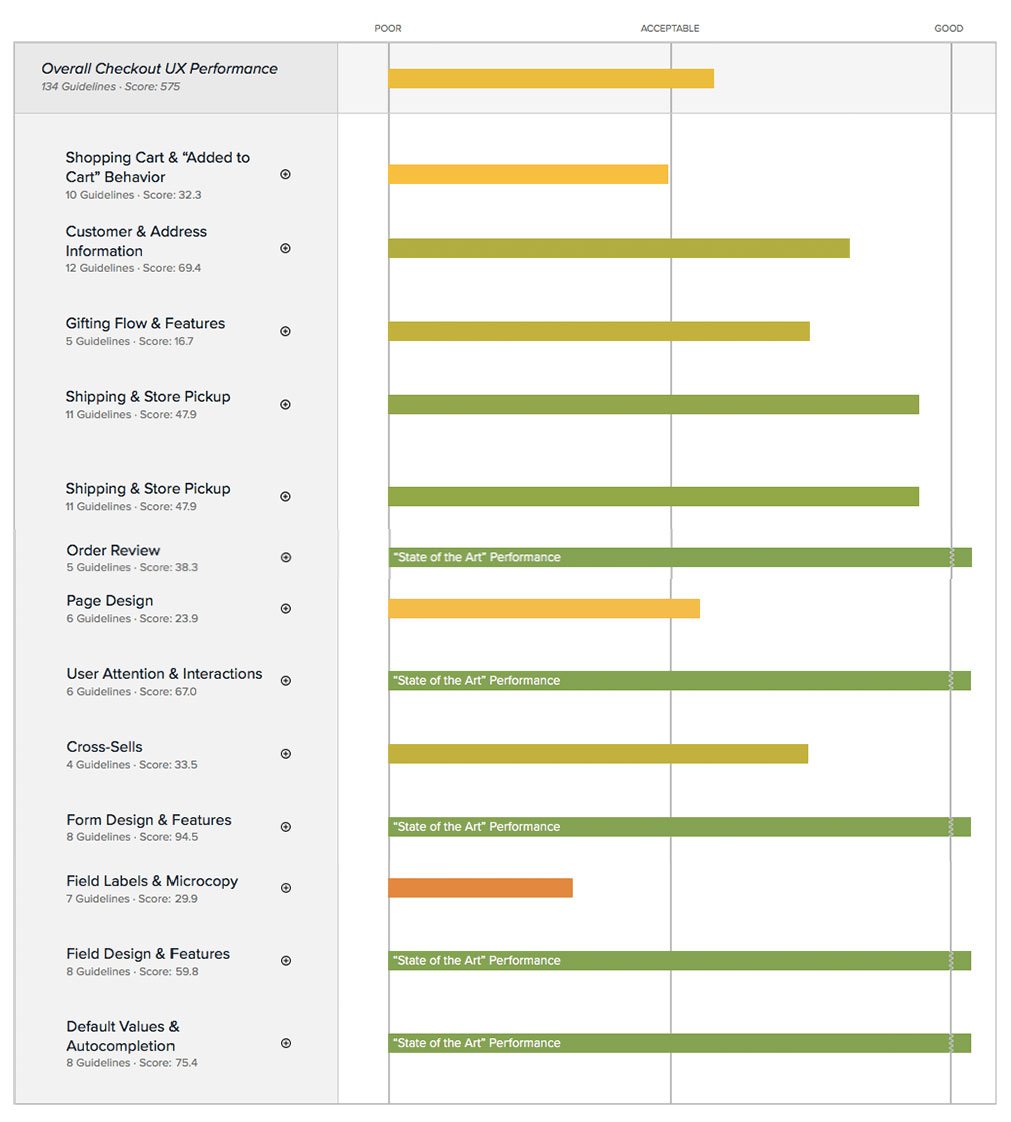
Sephora’s Checkout UX scored an overall performance of 250 on the Baymard Institute’s cart and checkout benchmark. Some of Sephora’s biggest checkout usability issues were due to
Poor Layout
Broken Focus
Broken Data Input
250

DESIGN STRATEGY
Using the following approaches to develop and implement design solutions that align with Sephora’s overarching business objectives and user needs.
-
Using 134 checkout usability guidelines from Baymard usability tests, we noted areas where our flow was sub-par.
Benchmarked checkout flows of 50+ eCommerce sites, including industry leaders and startups, to assess shopping cart performance and feature effectiveness.
-
We thoroughly analyzed Sephora's checkout experience with current customers focusing on app and web interactions to reduce cart abandonment.
Our research covered various aspects such as user privacy, form usability, and checkout flow, integrating industry best practices and data insights to prioritize key pain points and enhance the overall user experience.
-
Sephora must ensure that its checkout process remains user-friendly, efficient, and conducive to enhancing user satisfaction and conversion rates.
Responsive Design: Guarantees smooth browsing and purchasing across all devices.
Intuitive Navigation: Seamlessly guides users through the cart and checkout process.
Clear Feedback: Offers immediate alerts and guidance for any encountered errors or issues.
Interactive Elements: Facilitates effortless editing of cart items and application of discounts.
-
Analytics data revealed that a significant percentage of users abandon their carts during the checkout process, particularly when they reach the stage of entering payment information. Upon further investigation, it was discovered that customers encountered difficulties with navigating the multiple steps required for checkout and felt overwhelmed by the number of steps/fields to fill out.
-
We conducted 3 rounds of A/B testing with multiple billing & shipping designs, iterated on user-friendly Captachs and used Google Analytics to understand customer behavior.
REDESIGNED CHECKOUT FLOW
REMARKABLE ACHIEVEMENTS
↑ 43%
The overall UX performance score increased by 43%
↑ #10
We Ranked #10 out of 50 sites
↑ 74
The new design adhered to 74 usability guidelines
THE RESULT
Sephora earned “State of the Art” designations in 5 categories:
Order Review
User Attention & Interactions
Form Design & Features
Field Design & Features
Default Values & Autocomplete
575
PROCESS
01/ Discovery
We initiated the development of Basket in response to a notable increase in dropouts. Throughout the design process, we diligently implemented the following best practices and crafted both Accordion and Wizard layouts optimized for both mobile and desktop platforms.
1. Products and CTA
Clear product details (photo, quantity, color, etc)
Small unobtrusive remove button, save for later and change details like size
The primary call to action is clear
Checkout button at the top of the cart
2. Shipping and Costs
The total price is clear (including shipping and tax)
Standard delivery costs are made clear
Updating delivery options carried out within the cart
Free delivery threshold promoted to encourage an increase in order value
3. Additional Info
Payment options
Free returns clearly promoted
Secure shopping is made clear
Design Approaches
We designed three basket layouts based on the content priorities of the cart.
1. Column layout: Promo tap
2. Column layout: Promo drawer on the top
3. Column layout: Promo drawer
02/ Usability Testing
In order to validate our new checkout design flow, we conducted 3 rounds of 1-hour long A/B testing with 2 different versions of the “checkout billing/shipping” designs (Accordion and Wizard), 3 alternate “Captcha” versions, and 2 different versions of “Cart” designs. The testing covered 75 subjects in 2 clickable prototypes.
Usability study group:
12 users: 7 new users; 5 existing users (desktop and mobile)
Done mobile shopping within the last 6 months
Have experience shopping online at competitor sites (Ulta, Macy's, etc.)
03/ Research Insights & Iterations
1. Cross-platform takeaways:
All alts were "simple" and "expected".
All participants stated that a site should allow for guest checkout.
Account creation towards the end of checkout is appropriate and expected.
All users were familiar with and accepting, of the captcha.
No one called out the dimmed accordion steps or the progress bar on the wizard.
New sign-in (single email field for all users) was understood and welcomed.
Participants realize mobile should be simple fast and easy. The desktop is more for exploring.
Basket card sort activity: priorities were the same for mobile and desktop, however, users expect less content on mobile so that they can focus on checking out quickly.
2. Mobile design takeaways
Both prototype (Accordion and Wizard) alts and production were judged to be the same and therefore there were no preferences of experience.
The accordion checkout design was the clear winner. The one-page design and animation made them feel like they were making progress.
The accordion basket with the promo tabs was a clear winner.
User "edit" button instead of a carrot to take them to the edit detail page is preferred by all participants.
Users assumed My Loves was based on past purchases or things they loved on the site and recognized that it was different than Beauty Grabs
→ UX recommended showing past purchases that may need to be re-ordered.
3. Desktop design takeaways
The accordion checkout design was the clear winner. The one-page design and animation made them feel like they were making progress.
The accordion basket with the promo tabs was a clear winner.
The user didn’t mind being show products in the basket (it was expected). But, they all assumed Beauty Grabs is recommended specifically for them (or "use it with” based on items in the cart).
Users assumed My Loves was based on past purchases or things they loved on the site and recognized that it was different than Beauty Grabs
→ UX recommended showing past purchases that may need to be re-ordered.
Sign-in as a Lightbox over basket was preferred by all.
When editing an address almost all users preferred showing saved addresses on the screen with an “add new address” CTA vs Clicking to view saved addresses.
No one noticed if the right rail basket was showing/hiding. However, when looking at the printouts, they liked the ability to see all items while checking out.
→ UX recommended to keep it closed until the review step and/or A/B test. When the right rail basket was open users wanted to see to show ALL items vs. having to scroll through them.
The live site was thought to have a confusing layout with redundant information.
Robust Process
Having a structured methodology is vital for nurturing creative thinking. When I fully understand the step-by-step progression of researching, ideating, conceptualizing, testing, and iterating a design, it empowers me to unleash my creativity within these well-defined boundaries
Streamline Collaboration
Collaborating with two other designers and our design manager, we successfully streamlined processes and established effective collaboration with cross-functional teams. Together, we achieved outstanding results, bolstering Sephora's global standing as a leader in digital innovation and forward-thinking.
Exceptional Outcomes
We streamlined Sephora's checkout flow, enhancing user experience and efficiency. This resulted in smoother transactions, increased customer satisfaction, and reinforced Sephora's reputation for outstanding online shopping experiences.


